Case Study · Branding & Visual Design
AirCon
A calm, confident brand identity for AirCon — logo, colour, type and a componentised card system, built to carry the product and the website.
My role
Tools
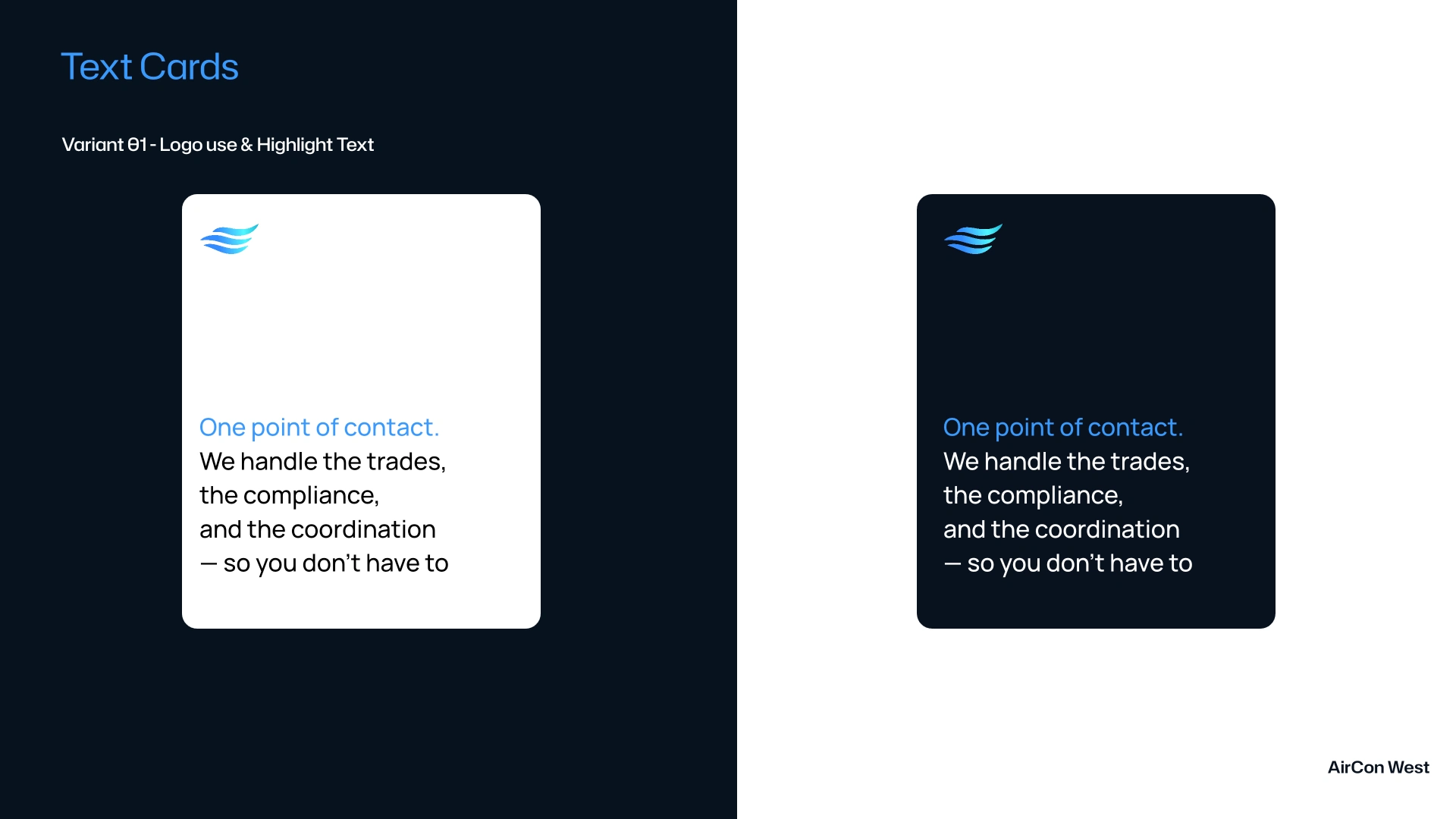
AirCon came as a full branding build: a logo system that works in dark and light, a distinctive colour and image-gradient language, a type system with its own highlight treatment, and a componentised set of cards that keep every surface consistent.
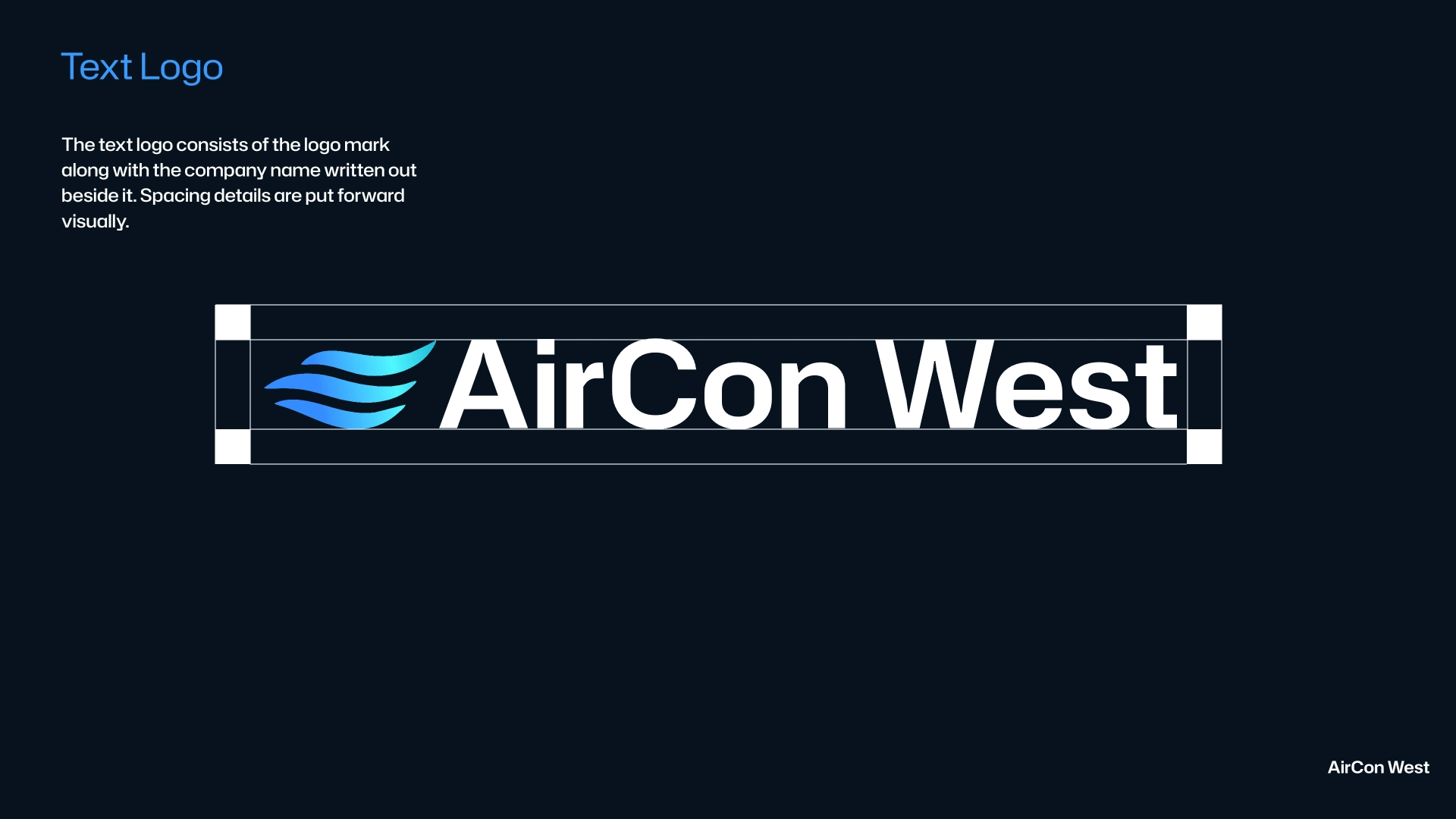
The work started with the mark and its clear space — a standalone logo and a combined lockup with the wordmark — then grew into the palette, typography and the repeating components the product would lean on.
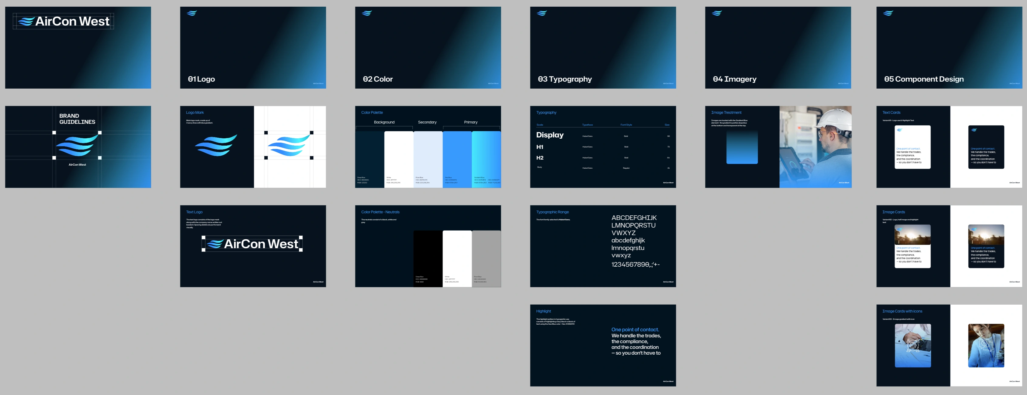
Below is the full system: the logo and its variants, the colour and gradient language, the type range and highlight effect, the three card variants, the homepage teaser, and the complete Figma board the identity lives on.
01 · The Logo
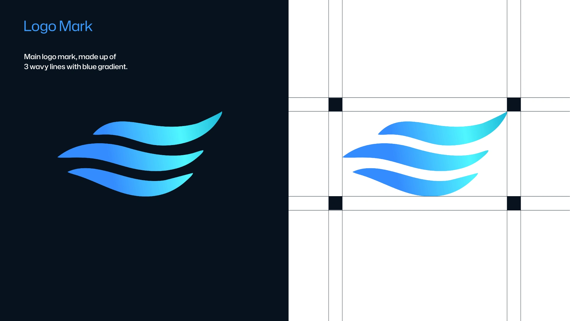
A mark for dark and light
The identity starts with the mark — drawn to hold its own on any surface, with a dedicated dark-and-light treatment and a combined lockup carrying the wordmark.
02 · Colour
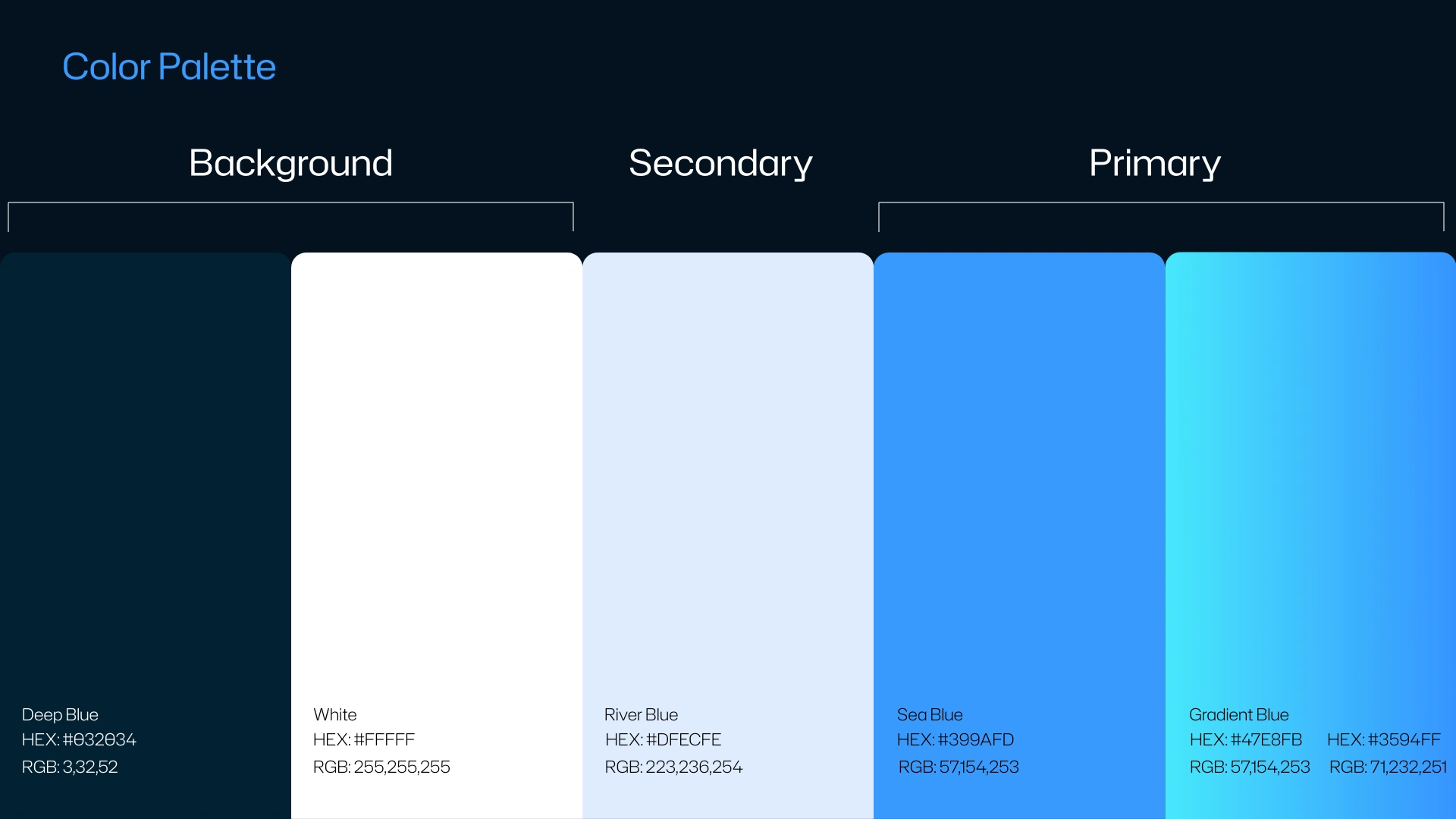
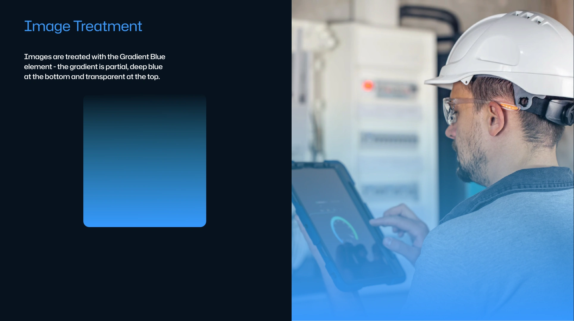
A palette with its own image treatment
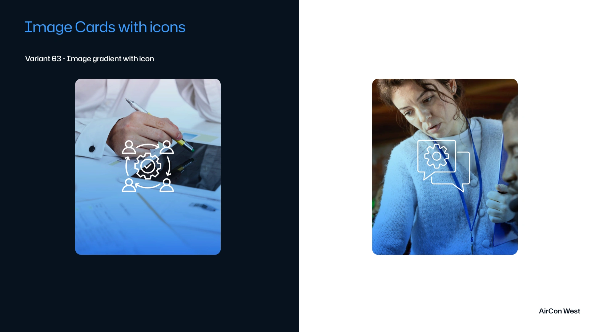
The colour system pairs a considered palette with a signature image-gradient effect — a treatment that makes photography feel like part of the brand, not content dropped on top.
03 · Typography
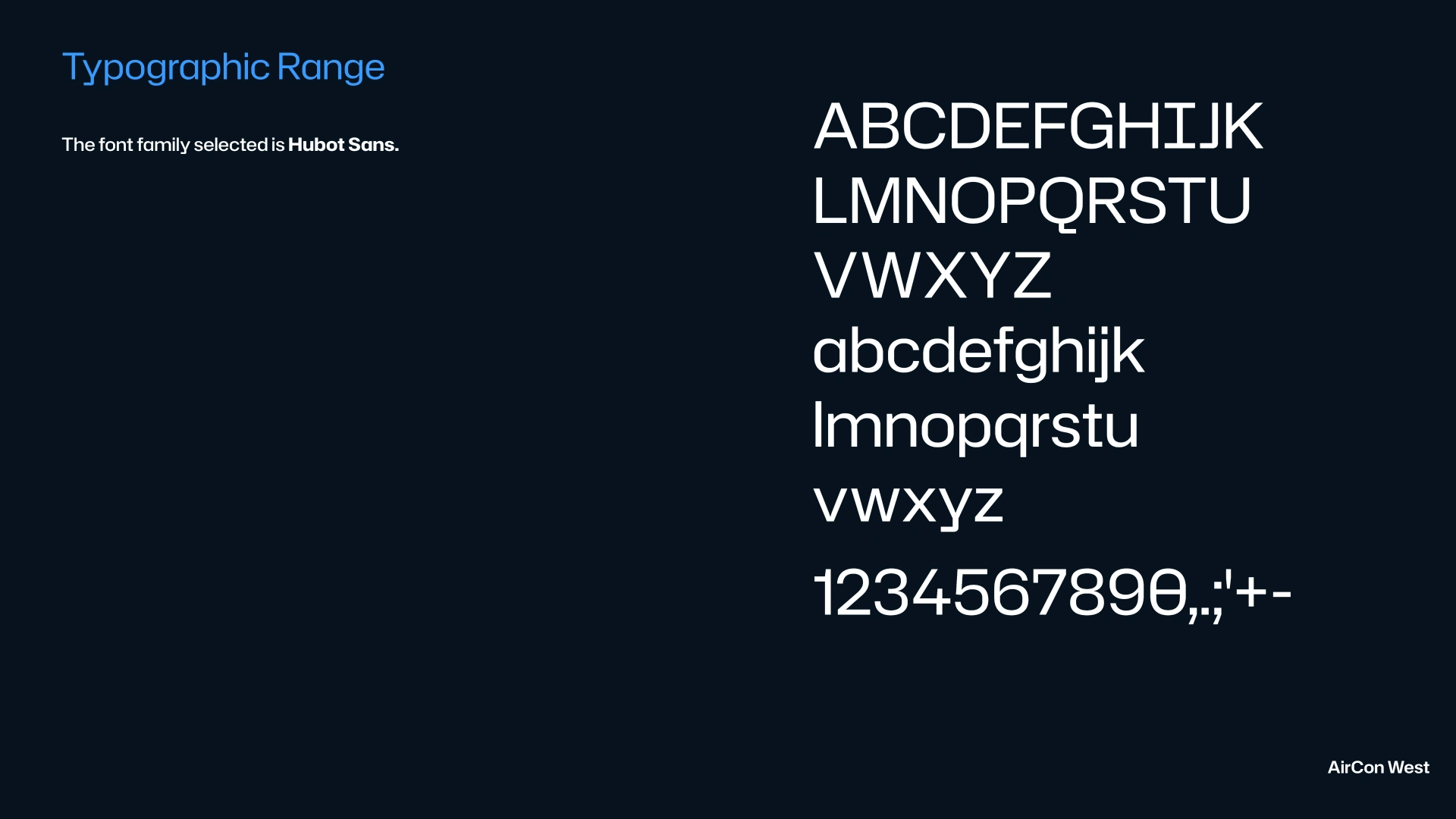
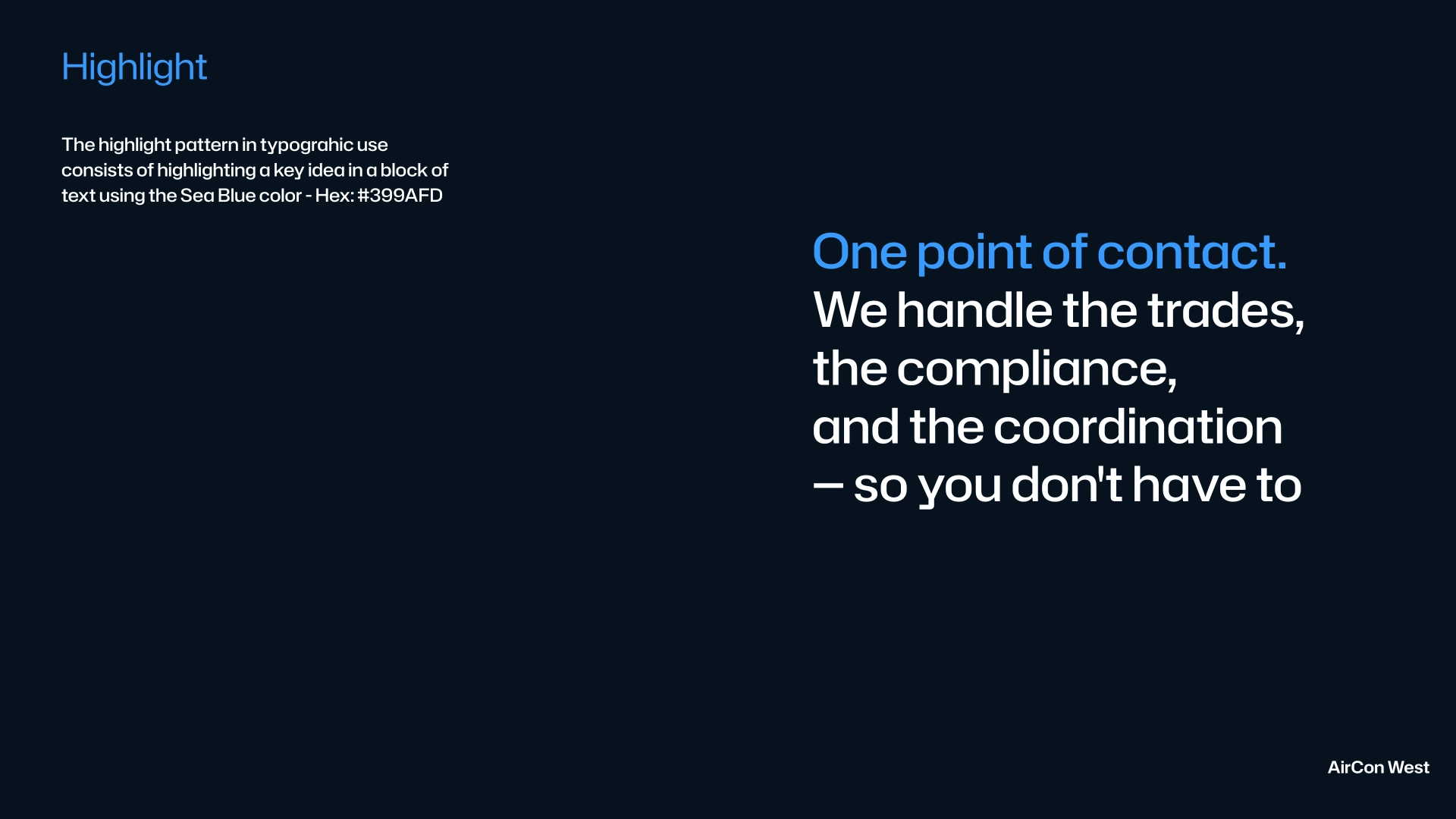
A type system with a highlight effect
The full type range keeps every message on-system, and a signature highlight effect turns emphasis into a brand move rather than an afterthought.
04 · The Card System
Three variants, one language
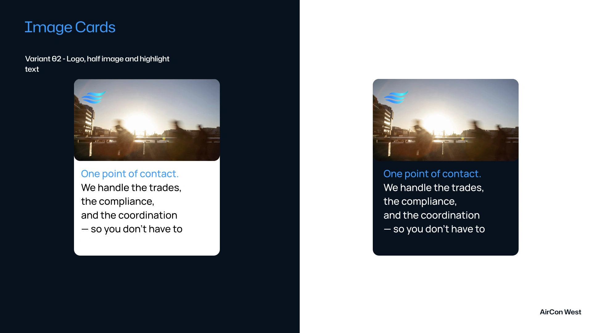
Text-only, image-gradient and text-plus-image cards — a small component set that stays consistent across the product and the website.
05 · The Website
The identity on the homepage
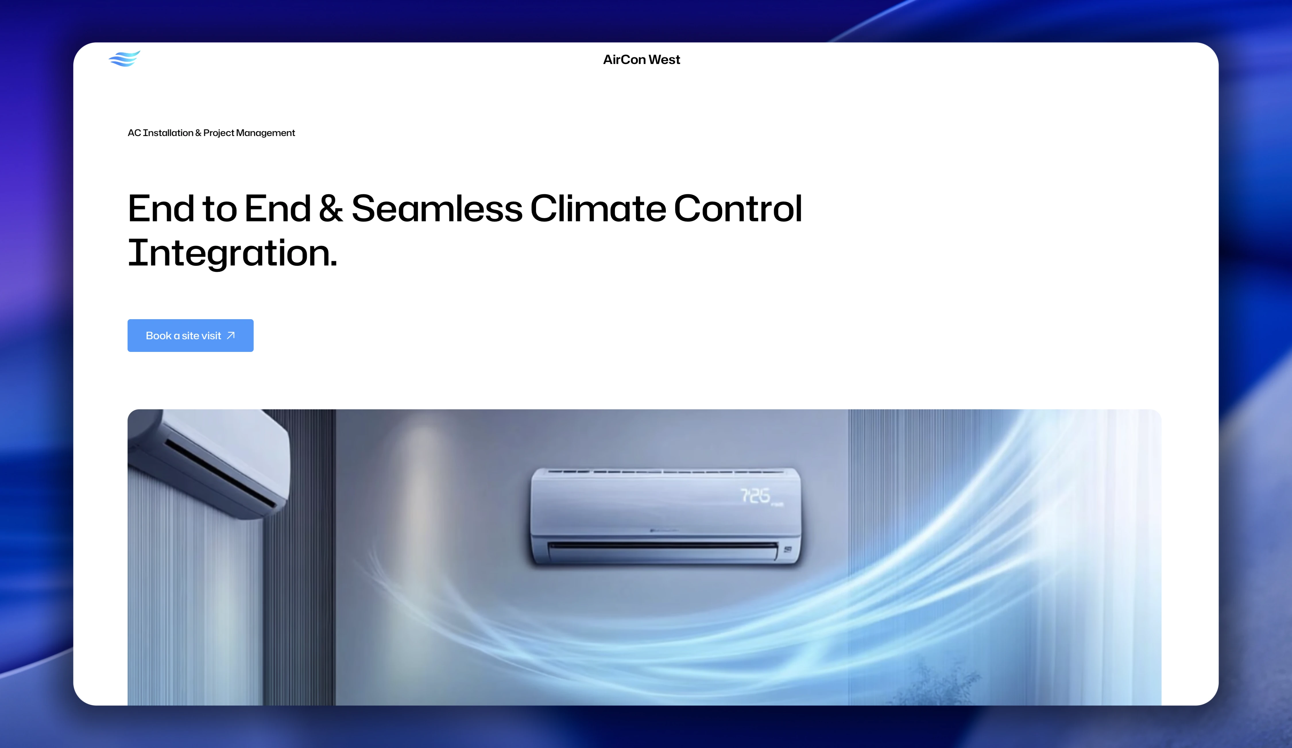
A homepage teaser showing the system at work — the logo, colour, type and cards coming together as a screen.
06 · The System
The whole identity on one board
The complete Figma board the brand lives on — every decision, from mark to component, in one place.