Case Study · Web Design & UI/UX
Portals Website
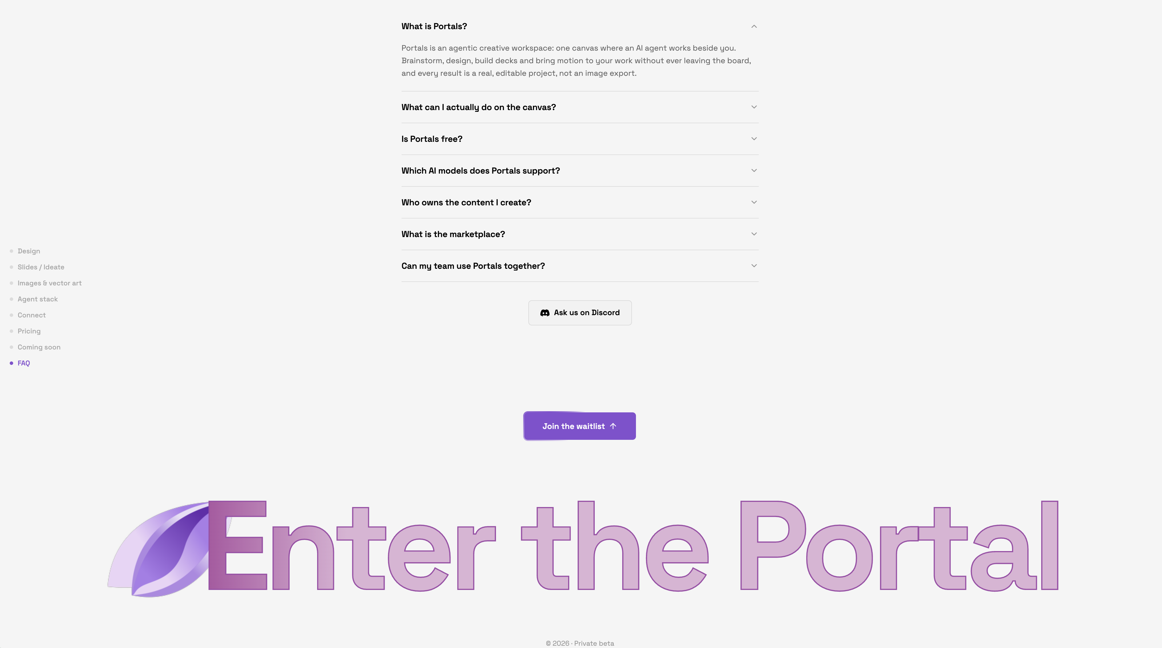
The Portals website: the product itself becomes the marketing. Real screens, real components and a full-width footer with a looping generative shine.
My role
Tools
Portals is a creative workspace, and its website is built the same way: the brand system, the colour palette and the typography come straight from the product, so the site feels like the app before you ever log in.
Instead of stock mockups, the page features real product screens, screen recordings and the actual components from the app, including the AI-native touches: subtle generative effects and the looping shine that runs edge to edge through the footer.
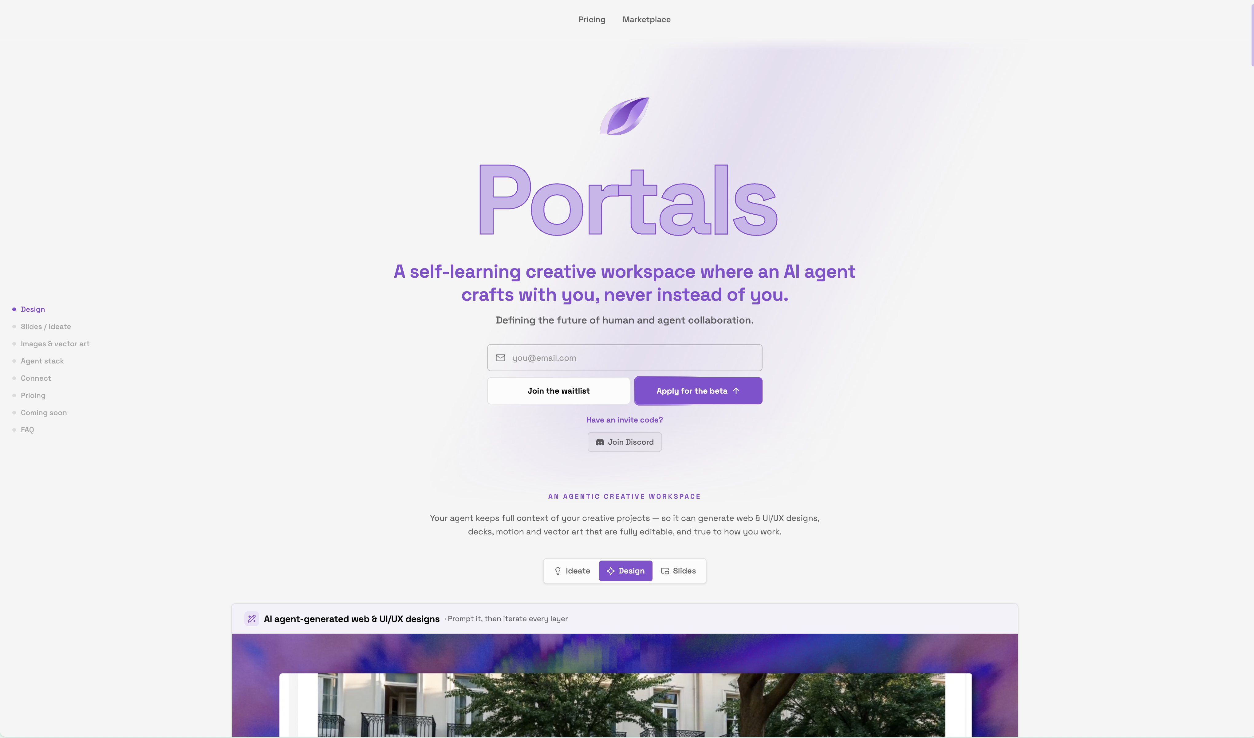
Scroll through the full build below, from the hero with its looping logo animation down to the marketplace, where user-made generations flow through a swipe-card feed and a waterfall gallery that opens each piece in a lightbox.
01 · Live
See it for real
The site is running right now. Open it and click around.
02 · Hero
A hero that moves like the product
The hero opens with a looping logo animation, setting the tone before a word of copy is read. The product stays front and centre.
03 · Navigation
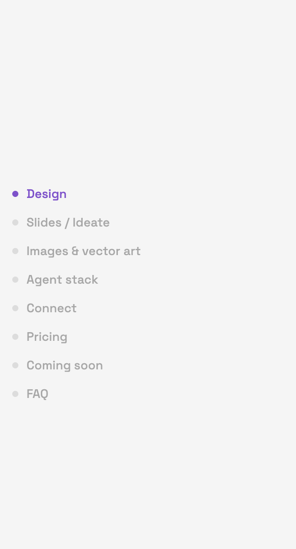
Navigation from the app itself
The side navigation is the same component the app uses. What you build with is what the site advertises.
04 · Agents
The agent stack, shown live
A screen recording walks through the agent workspace: MCP connections and skills in action, straight from the product.
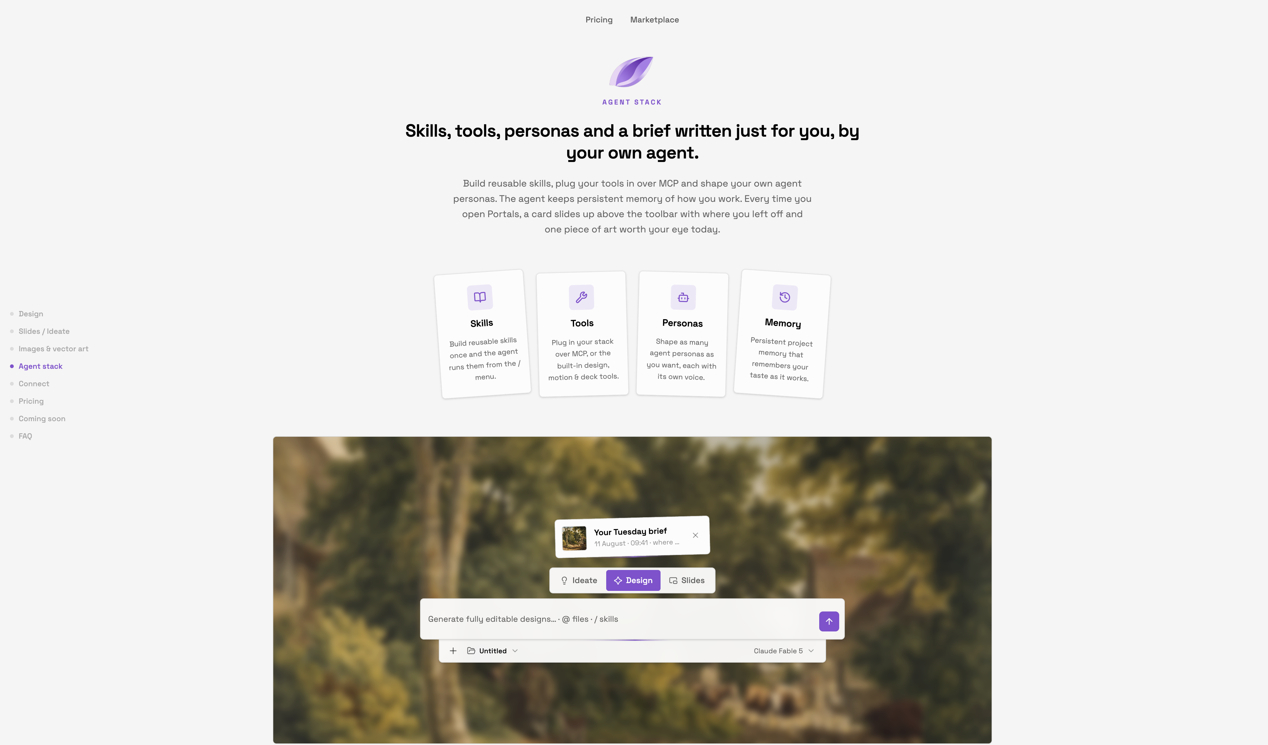
05 · Agent Stack
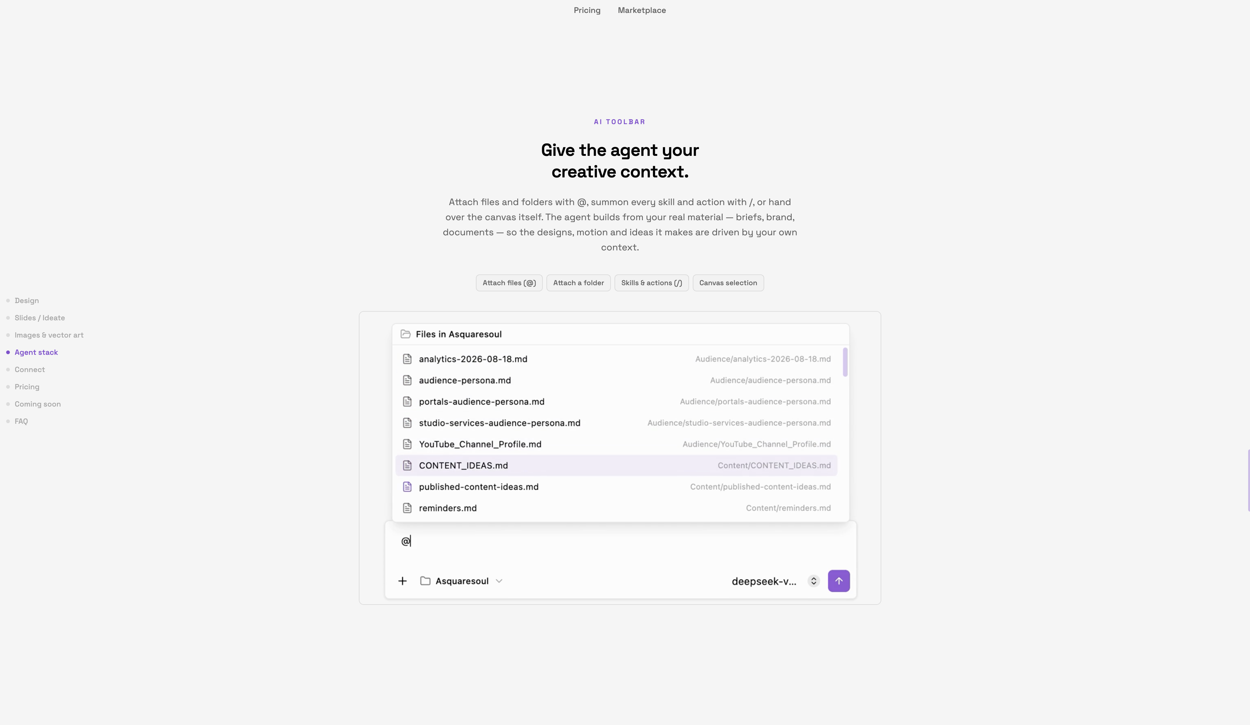
Real components, not mockups
The agent stack section is built with the actual art components from the app, so every element on the page is a real product component.
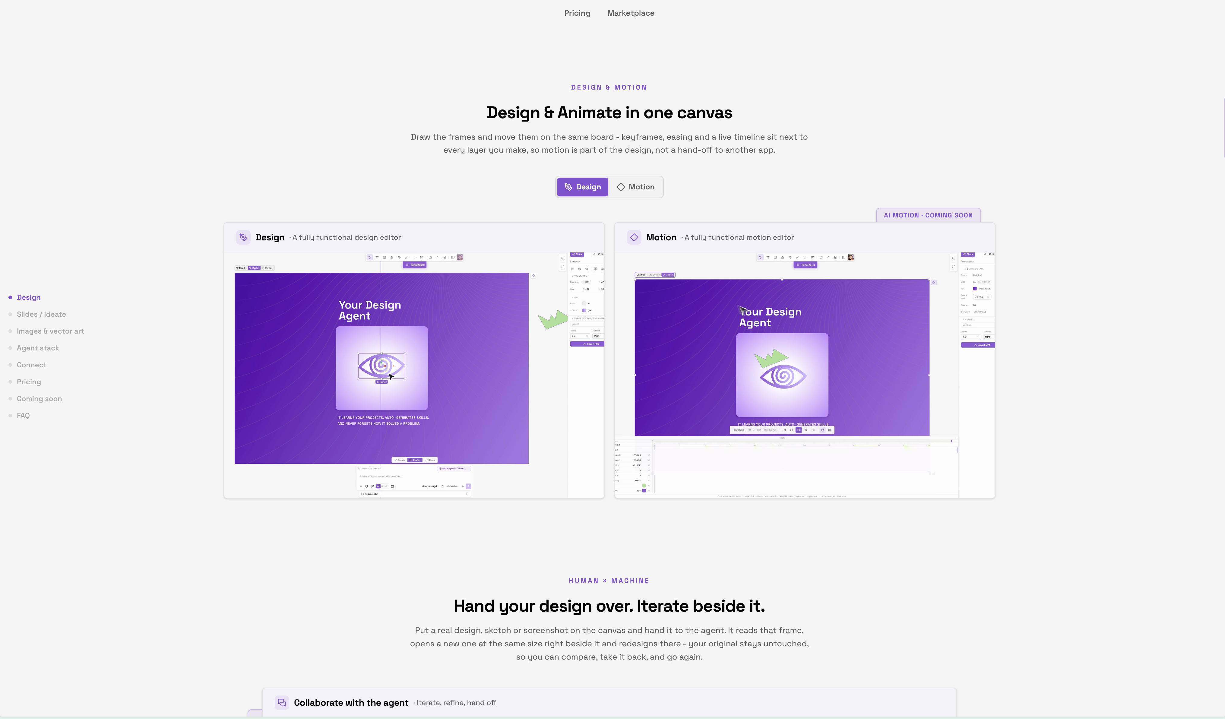
06 · Compare
Design and motion, side by side
The compare view shows related components in the design and motion editor, making the tool’s core workflow visible at a glance.
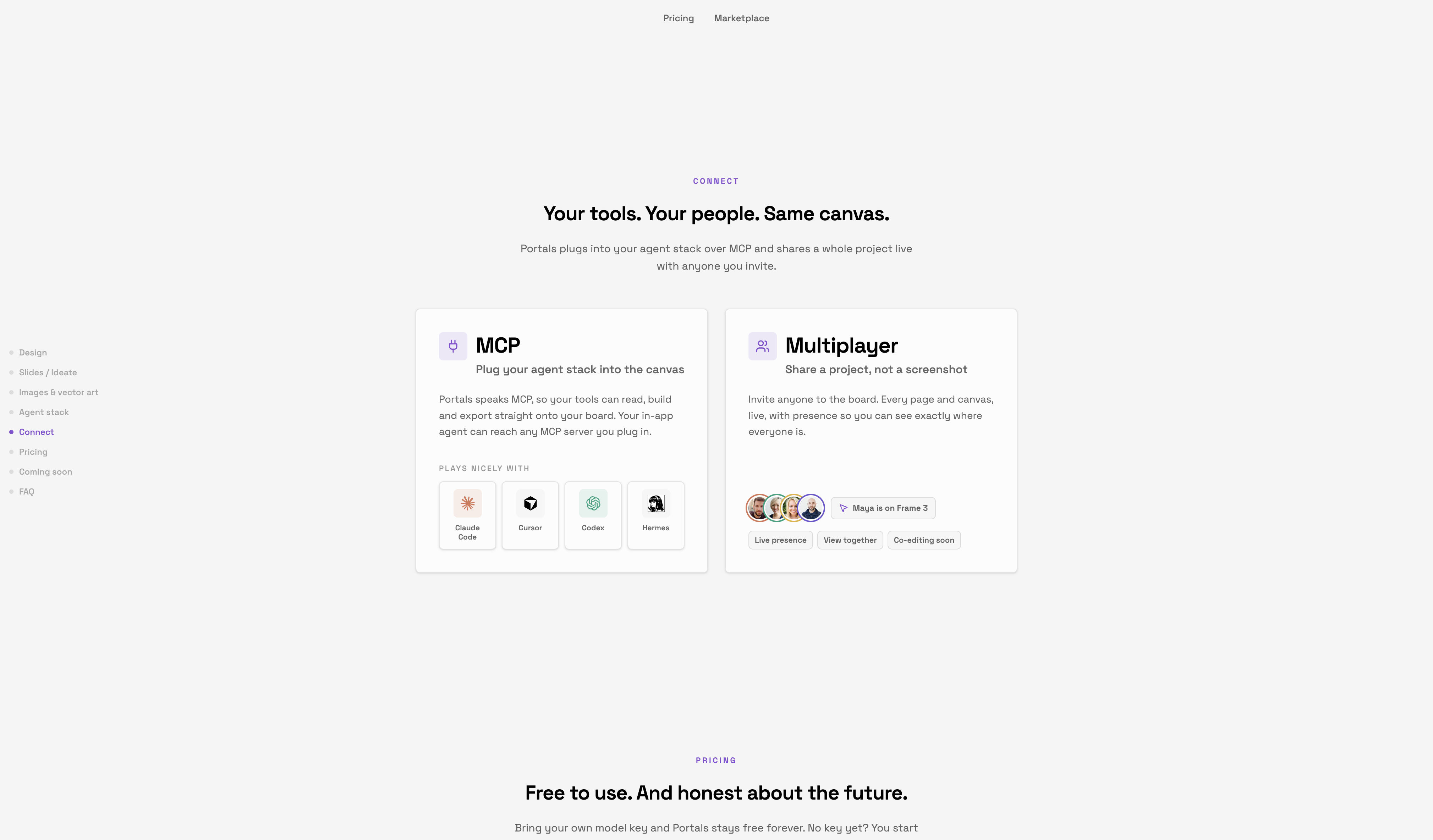
07 · Connections
MCP and multiplayer, in cards
Connection cards present the integrations: MCP servers and multiplayer sessions, two of the features that set Portals apart.
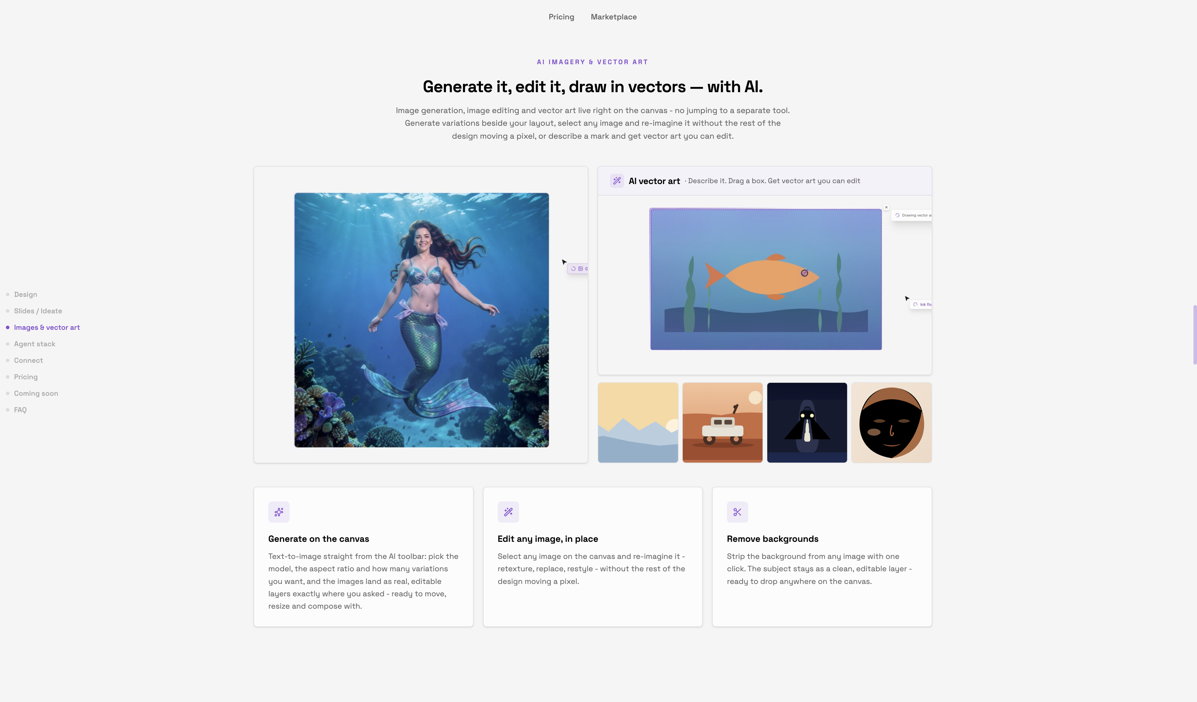
08 · AI Features
Generative features, one bento
A bento grid lays out the AI features. The AI theme runs through the site’s effects too, always subtle, always in service of the product.
09 · Roadmap
Where it’s going
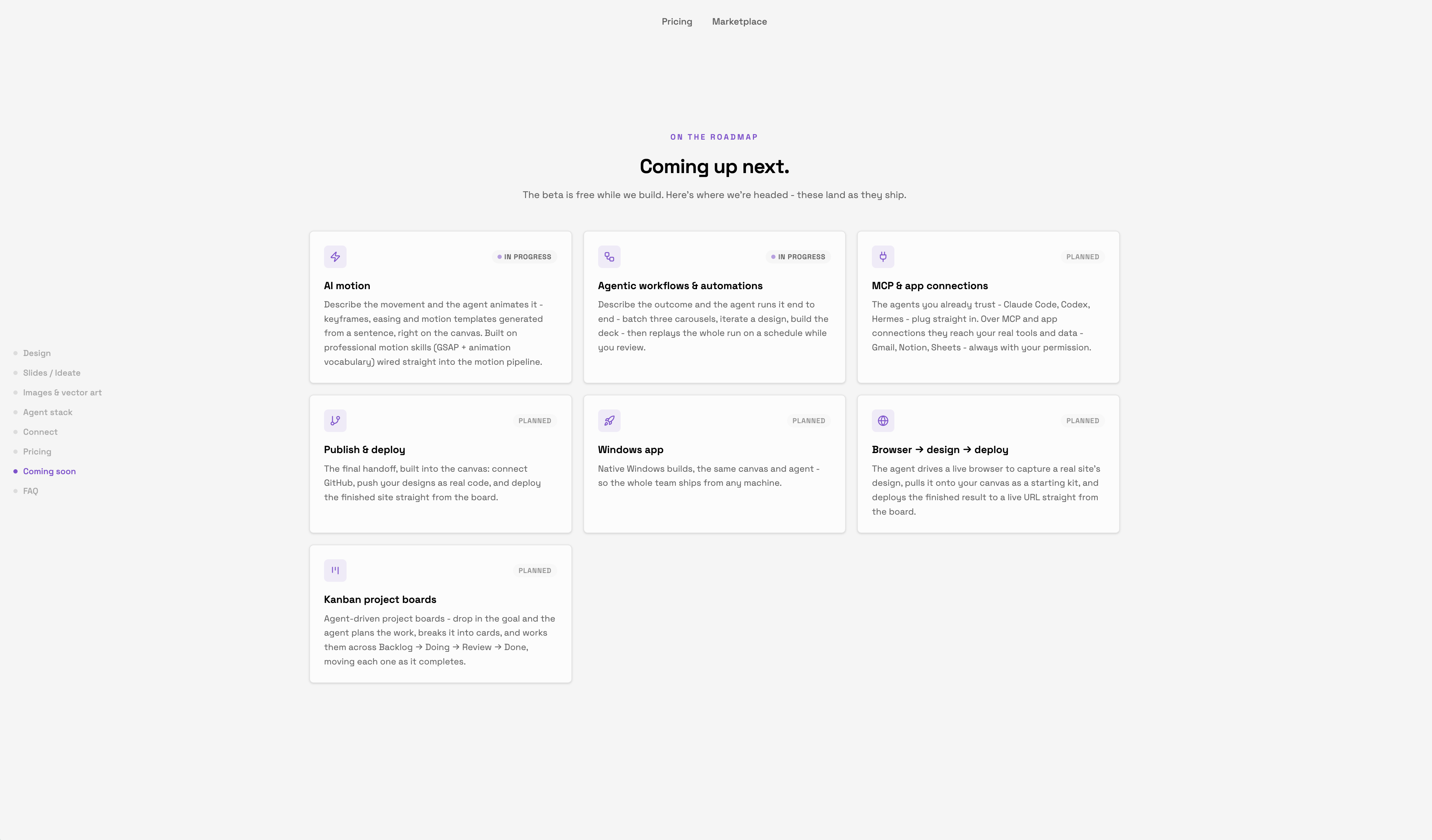
Roadmap cards show what comes next, so early users see the direction as clearly as the current feature set.
10 · Marketplace
Swipe, browse, open
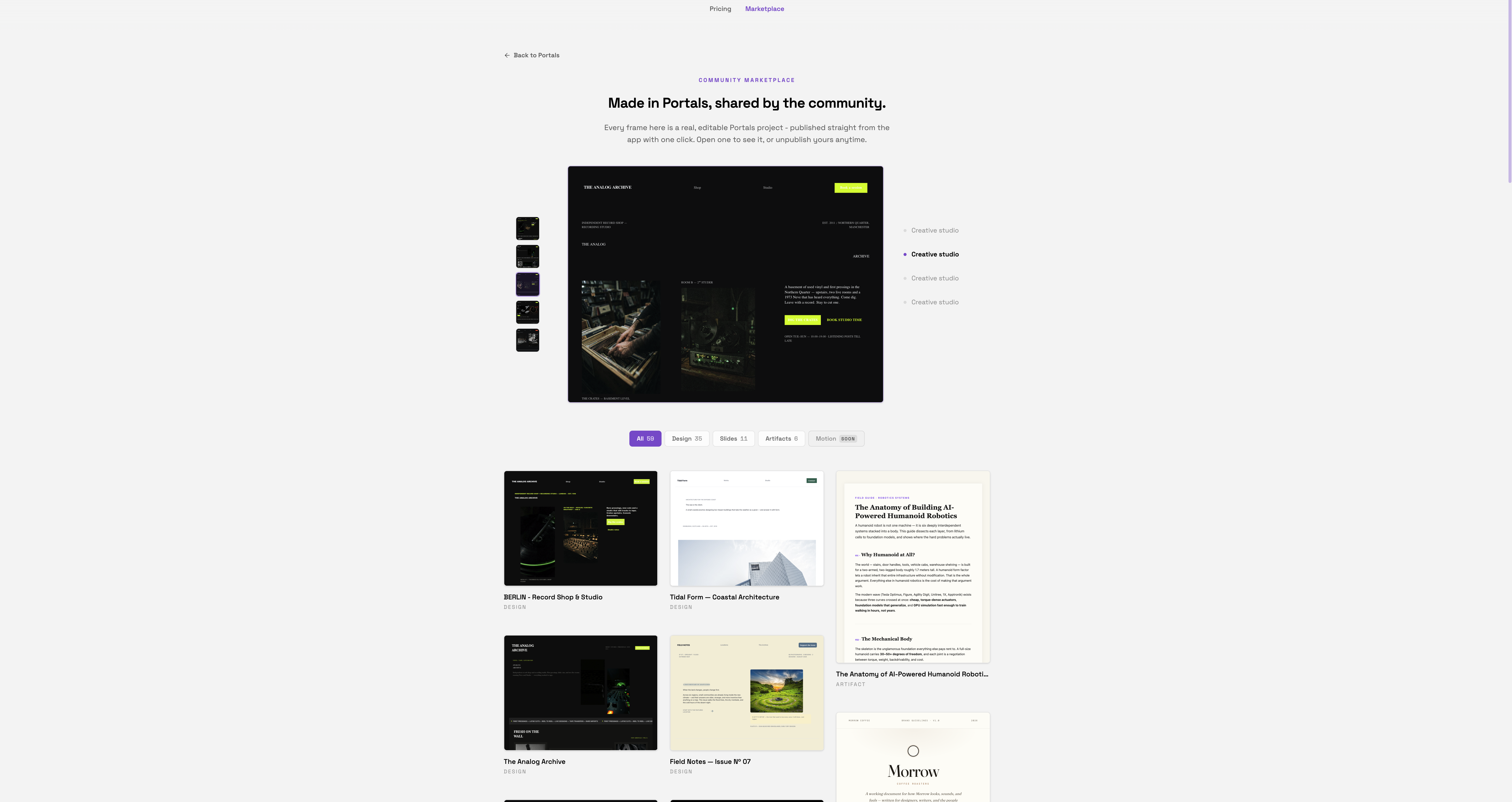
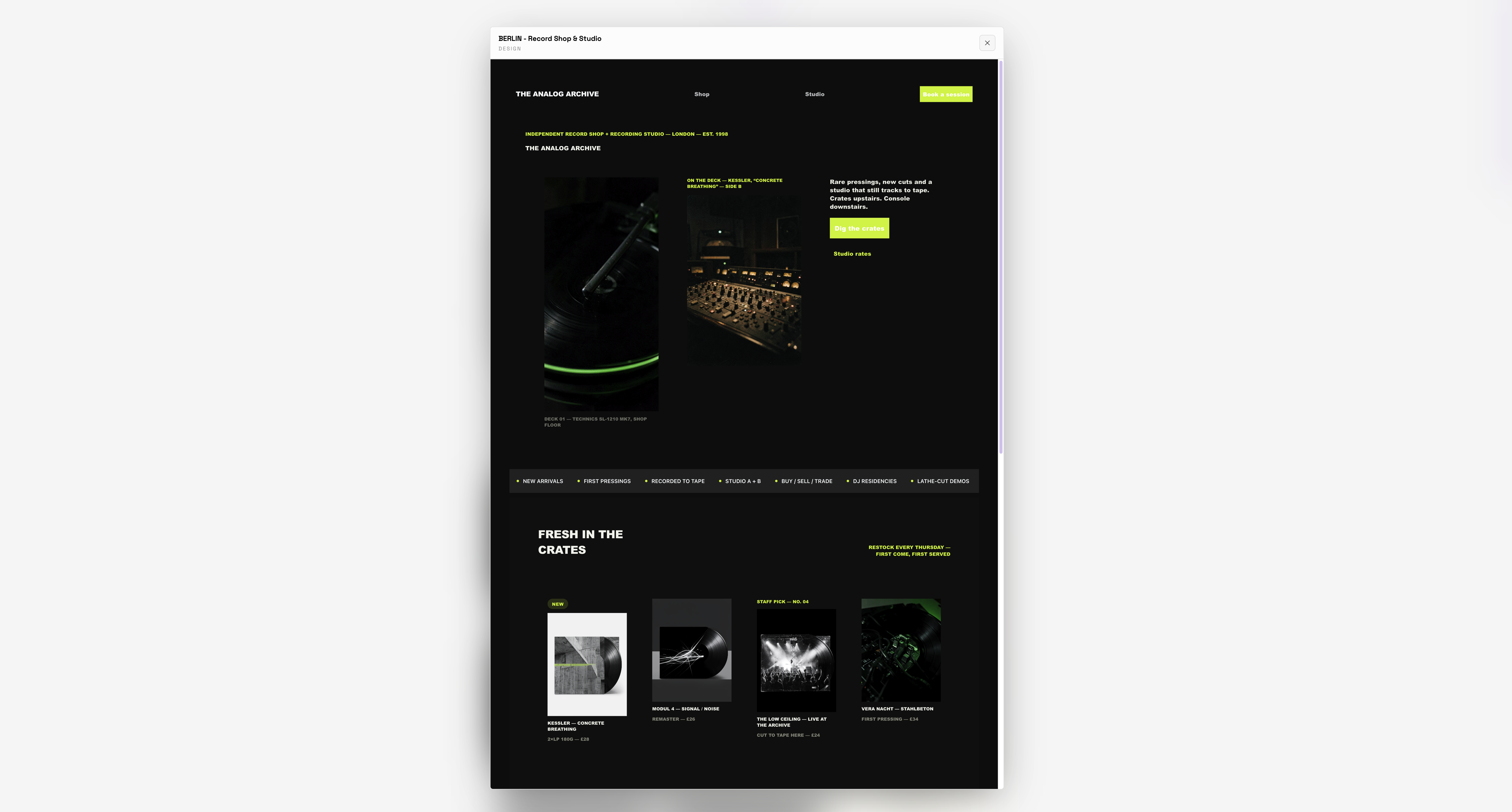
User-made generations flow through a swipe-card feed, with a waterfall gallery underneath. Clicking any piece opens a lightbox to preview the work and see how it was made.
11 · Footer
A full-width footer with a loop
The site ends edge to edge with a looping generative shine moving through the footer text, the same AI-native touch that runs through the product.